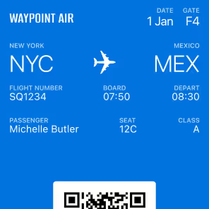
Wallet Passes Are Posters Now.
The artwork is no longer decoration around the pass. It becomes the visual foundation of the pass.
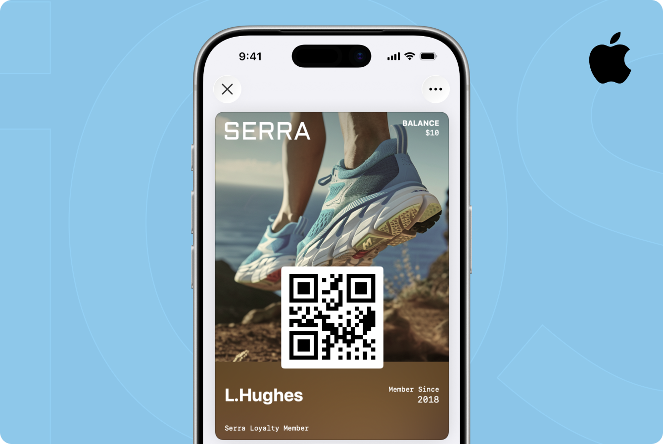
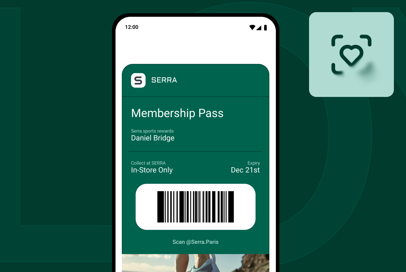
Apple Wallet Passes Are Posters Now.
The Poster Layout has come to loyalty, membership, and gift card passes. Badge has supported it since day one.
With iOS 27, the Poster Layout Apple built for event tickets has come to everyday passes. Membership, loyalty, rewards, coupon, and gift card passes can now use it, and Apple calls the resulting pass style the Poster Generic Pass. Instead of designing around the narrow strip artwork that has defined Wallet passes for years, brands can build around prominent imagery, richer typography, and a more flexible information hierarchy.
It is a major visual upgrade.
But adopting it is not as simple as replacing one image with another.
Brands now need to design for two Wallet experiences at the same time: the Poster Layout for customers on iOS 27 and the legacy pass layout for customers running earlier versions of iOS.
That changes both the design workflow and the way teams need to think about Wallet infrastructure.

What is the Poster Layout, and what is a Poster Generic Pass?
The two names get used interchangeably, so it is worth separating them. The Poster Layout is the presentation: prominent artwork carrying the pass, with header fields at the top, a square QR code, and primary and footer fields below. Apple introduced it first for event tickets.
The Poster Generic Pass is what Apple calls that layout applied to everyday passes, and posterGeneric is the style key you set in the pass itself. That key is the only part of this your engineers need; everything else here is a design decision.
Apple describes it as a format for passes like memberships, loyalty cards, coupons, rewards, and gift cards, with prominent artwork and more flexibility over the information displayed. Critically, it carries the poster presentation without the event-specific semantic structure event tickets require. You get the look without being forced into a schema built around venues, seats, and performers.
For more than a decade, most non-ticket Wallet passes have operated inside a fairly constrained visual system: logo, fields, barcode, and, depending on the pass type, a narrow strip or thumbnail image.
The Poster Layout changes that relationship.
The artwork is no longer decoration around the pass. It becomes the visual foundation of the pass.
That gives loyalty and membership programs significantly more room to express the brand rather than looking like variations of the same Wallet template.
What the Poster Layout changes structurally
The visual redesign comes with a different information architecture.
The Poster Layout supports a header field, up to four primary fields, two footer fields, back fields, additional info fields, full artwork, and a square QR code. By comparison, the legacy Generic pass layout supports up to three header fields, one primary field, a thumbnail, up to four secondary and auxiliary fields combined, and a rectangular barcode.
That difference matters.
With a traditional pass, there was effectively one piece of information competing to be the primary message. Maybe it was a points balance. Maybe membership status. Maybe a gift card balance.
With the Poster Layout, brands have much more flexibility.
A loyalty pass could surface a member name, tier, points balance, and expiration date together. A membership pass could prioritize member status, ID, renewal date, and benefits.
But additional space does not mean every field should be filled.
The best Poster Layout passes will still have a clear hierarchy. The goal is not to put more information on the pass. It is to make the most important information easier to understand.
Your existing Wallet artwork probably won't carry over
The format hands you a bigger canvas. The only real consideration is what goes on it.
Existing strip artwork was built for a completely different canvas.
Traditional strip images are narrow horizontal assets designed to occupy one region of the pass. Poster Layout artwork carries the whole composition.
That means simply stretching or cropping an existing strip image is unlikely to produce a good result.
Photography may need to be recomposed. Brand marks may need different placement. Focal points need to account for fields and barcodes appearing on top of or alongside the artwork.
And any text baked directly into your existing imagery deserves particular attention.
Text baked into an image cannot be read by VoiceOver, and images render differently across devices and screen sizes. Informational text belongs in pass fields, where Wallet can lay it out and assistive technology can reach it.
In other words, the Poster Layout requires a new asset strategy, not an image resize.
You still need the old pass
This is the most important implementation detail.
The Poster Generic Pass style requires iOS 27 or watchOS 27 or later. Customers running earlier operating systems still need a pass format their device understands.
Maintaining both pass styles is what keeps the pass working on every iOS device.
A single pass can contain both the new posterGeneric style and a legacy style such as generic, storeCard, coupon, or eventTicket.
When the pass opens on a supported device, Wallet prioritizes posterGeneric. On an older device, Wallet renders the compatible legacy style instead.
One pass. Two layouts.
You do not need to create a separate loyalty program or issue different credentials depending on someone's operating system.
But the fallback does need to be built.
Backward compatibility is not something brands should assume will happen simply because they have adopted the Poster Layout. Your pass package needs to include the fields and assets necessary for customers on earlier operating systems.
For design teams, that means maintaining two experiences that should still feel like the same brand.
For engineering teams, it means supporting both style definitions inside the pass.
And for anyone managing Wallet infrastructure long term, it means another template that needs to stay current as Apple evolves the platform.
Design for both formats from the beginning
The temptation will be to build the Poster Layout first and treat the legacy layout as a fallback in every sense of the word. That is the wrong approach.
A meaningful percentage of your pass holders will remain on older operating systems during the upgrade cycle. Their experience should not suddenly look like an afterthought. The poster and legacy layouts should be designed together.
The artwork may change. The field hierarchy may change. Some information may move between the front and back of the pass. But the brand, purpose, and most important information should remain consistent.
It is one credential presented through two different Wallet layouts.
The Poster Layout and Featured Actions were built to work together
A Poster Generic Pass supports up to two Featured Actions, the tappable cards Apple shipped alongside it in iOS 27.
That pairing is the point. Full artwork makes the pass worth looking at. Featured Actions give someone a reason to do something once they are looking. A membership pass can now carry real brand presence and a direct path to View Membership Benefits or View Offers and Rewards on the same surface, with no app involved.
One is presentation. The other is action. Shipping either without the other leaves most of the value unused.
What brands should do now
- Audit your current pass templates. Identify passes relying heavily on strip or thumbnail imagery, particularly assets containing baked-in text.
- Create Poster Layout artwork intentionally. Treat it as a new canvas rather than resizing an existing banner.
- Redesign the information hierarchy. Decide which information deserves the expanded primary-field space and what should remain secondary.
- Design the legacy experience alongside it. The Poster Layout and the fallback should feel like two versions of the same program.
- Validate backward compatibility before launch. Make sure customers on earlier versions of iOS still receive a functional, well-designed pass.
- Add Featured Actions where they create value. Use the pass not only to display information but to help the customer take the next logical action.
- Test across devices. Apple Watch does not display the strip image, the thumbnail, or the back of the pass, so anything essential needs to live where the watch can show it.
The hidden cost is maintaining both
This is the part that tends to get underestimated. The Poster Layout means new artwork specifications, a new pass style, new field decisions, and backward-compatible layouts living alongside the new experience. And it will not be the last Wallet change.
Apple added the Poster Generic Pass style, Featured Actions, new barcode formats, Pass Designer, and additional Wallet capabilities in the same release.
For teams maintaining their own Wallet infrastructure, every platform release creates another set of specifications to interpret, implement, test, and maintain.
That is the difference between creating a Wallet pass and operating Wallet infrastructure.
Badge handles the format. You build the experience.
That is the part Badge absorbs.
Your team supplies the brand, artwork, customer data, and experience you want to create. Badge handles the Wallet format, compatibility, pass generation, and updates underneath it. That means you can take advantage of the Poster Layout without turning every Apple Wallet release into a new infrastructure project. Badge has supported it since September 14, the day iOS 27 shipped, and customers are already building on it.
And because Wallet passes can update over the air, the experience can evolve as your customers upgrade their devices without requiring them to download a new pass.
Apple made the Wallet surface significantly bigger. Now brands need to decide what to do with it.
Talk to us about bringing your passes to the Poster Layout.
Sources: Apple Developer Documentation, “Creating a poster generic pass” and “Defining the metadata of your Wallet Pass.”